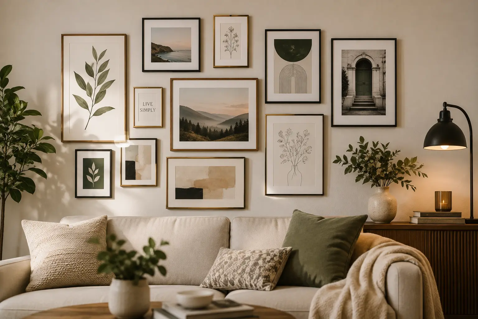

An empty wall makes a room feel unfinished, but a wall covered in mismatched pieces feels cluttered instead of curated. This wall art styling guide exists for exactly that gap — the space between “too bare” and “too busy,” where most home walls should actually sit.
A wall doesn’t need to be full to feel finished — it needs to feel intentional, and that comes from spacing and grouping, not quantity. — Shridya Editorial
Table of Contents
Start With a Focal Point
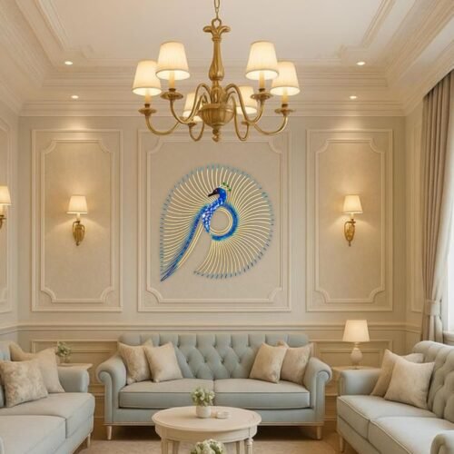
Every good wall art styling guide begins the same way: pick one anchor piece before adding anything else around it. This could be a larger painting, a striking metal wall art piece, or even a wall clock — something with enough visual weight that everything else can build around it rather than compete with it.
Showing 9–12 of 14 results
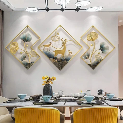
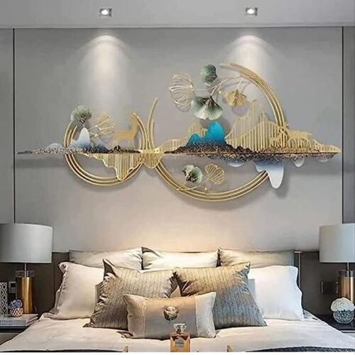
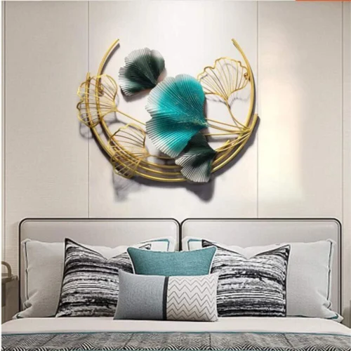
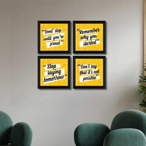
Spacing — The Rule Most People Get Wrong
Common Mistake: Hanging pieces too close together or too high above furniture. A reliable rule any wall art styling guide should give you: leave roughly 2-3 inches between pieces in a grouped arrangement, and hang the grouping’s center at eye level (roughly 57-60 inches from the floor) — not at the ceiling.
According to general design guidance from established home publications, gallery wall groupings tend to read as more cohesive when arranged within an imaginary rectangle rather than scattered loosely — a principle worth following even with an eclectic mix of pieces.
Mixing Different Types of Wall Art
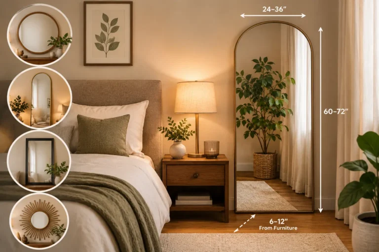
A wall art styling guide isn’t just about paintings — mixing mediums genuinely works well when done with restraint. Combining a framed piece, a small mirror, and a wall clock in one grouping adds visual interest without needing everything to match in style or frame color.
Showing 9–12 of 14 results
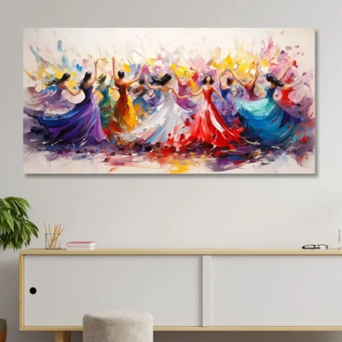
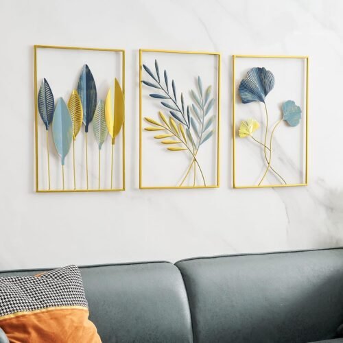
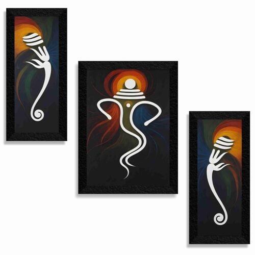
For pieces with more cultural or personal significance, traditional art styles like Madhubani work particularly well as a single anchor piece rather than part of a busy mixed grouping — letting the detail actually be seen.
Sizing for Your Wall
As a rough guide, artwork (or a grouped arrangement) should take up roughly 60-75% of the available wall space above a piece of furniture, such as a bed or console. Too small, and the piece looks lost; too large, and it overwhelms the room. This is one of the most common sizing mistakes this wall art styling guide sees repeated across small bedrooms specifically.
Gallery Wall vs. Single Statement Piece
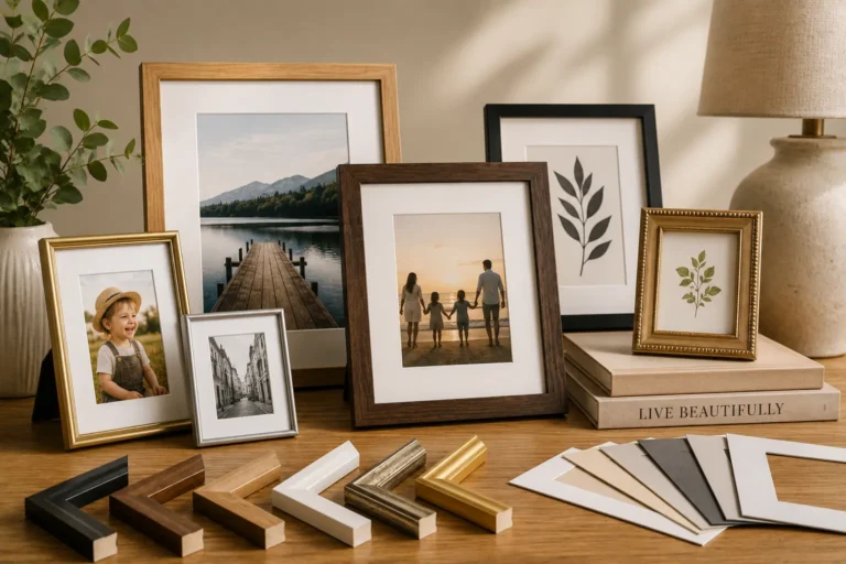
A gallery wall (multiple smaller pieces grouped together) suits a room that wants personality and story — family photos, varied art styles, collected pieces over time. A single statement piece suits a calmer, more editorial look, closer to the “premium simplicity” this wall art styling guide generally recommends for smaller rooms where visual clutter competes with limited floor space too.
Both approaches pair well with the palette principles from our Room-by-Room Home Decor Guide, which covers how colour choices tie a room together beyond just the walls.
Quick Checklist
Before you commit to hanging anything, this wall art styling guide suggests checking:
- Have you chosen one focal point before adding supporting pieces?
- Is your spacing consistent — roughly 2-3 inches between grouped pieces?
- Is the grouping’s center at eye level, not too high?
- Does the arrangement take up a proportionate amount of wall space, not too small or overwhelming?
- Gallery wall or single piece — which suits the room’s actual personality?
Key Takeaways
- A good wall art styling guide starts with one focal point, not a scattered collection.
- Spacing and eye-level placement matter more than the pieces themselves.
- Mixing mediums works well with restraint — don’t force everything to match.
- Size the arrangement to roughly 60-75% of the available wall space.
Every product mentioned here is personally checked by Shridya — for quality, real reviews, and honest value — before it earns a place on this site.
Conclusion
A wall art styling guide really comes down to intention over accumulation — one focal point, consistent spacing, and a size that suits the wall, rather than filling space just to fill it. Once you’ve got the basics right here, the same spacing and grouping principles apply whether you’re working with photo frames, mirrors, or full paintings. For more on tying a room together beyond the walls, see our Room-by-Room Home Decor Guide.
FAQs
How much space should be between pieces in a gallery wall?
Roughly 2-3 inches between grouped pieces creates a cohesive look without feeling cluttered.
How high should wall art be hung?
The center of the arrangement should sit at eye level, roughly 57-60 inches from the floor.
Should wall art match in style or frame colour?
Not necessarily. Mixing mediums and styles works well when arranged with consistent spacing and a clear focal point.